Originally published February 19, 2021 , updated on August 7, 2025

In an earlier blog[MOU1], we described the concept of a lead generation landing page and offered some suggestions on how to improve conversion rates. If you are receiving significant traffic but you are being frustrated by low conversion rates, there is a good chance that your landing page is not properly optimized. From your headline to your forms, every element has to drive one particular action.
This guide is here to help. We have deep dived into strategies relevant to working on your lead generation landing page so that it can be used to generate more conversions. Throughout, we provide actionable methods to improve the page and instructions on how to optimize a landing page for lead generation so that your outcomes will be even better.
1. Write Copy That Connects
Creating an effective lead generation landing page starts with persuasive body copy. This is an art that is not always easy to master. In the world of copywriting, the debate over short versus long copy is never-ending. Regardless of length, the ultimate goal is to engage your target audience and guide them smoothly through your sales funnel. While the copy should provide genuine value, it’s important to strike a balance so that readers don’t feel overwhelmed.
Here are some key tips for writing compelling body copy:
- Start with a Clear Value Proposition
Why it matters: Your readers need to understand right away how your offering benefits them. A clear value proposition grabs their attention and sets the stage for what’s to come.
Actionable Tip: Begin your copy with a sentence that directly answers, “What’s in it for me?” Focus on how your product or service solves a problem or improves their life. - Focus on Benefits, Not Just Features
Why it matters: Readers care more about how a product or service will help them than what it can do. Highlighting benefits resonates more with your audience and makes them see the value in taking action.
Actionable Tip: Instead of listing features, explain how each feature makes life easier or solves a pain point. For example, “Our software reduces time spent on administrative tasks by automating key processes.” - Use Bullet Points for Easy Scanning
Why it matters: Most people scan content rather than read it word-for-word. Bullet points make it easier for visitors to quickly grasp key details and decide whether your offer is right for them.
Actionable Tip: Break down important features or benefits into simple bullet points. This allows readers to absorb the essential information. - Engage Your Audience
Why it matters: A conversational tone makes the content feel personal and relatable, which increases trust and encourages readers to take action.
Actionable Tip: Write as if you’re talking directly to the reader – use “you” and “your” to make it feel like a one-on-one conversation. Keep the language friendly and approachable. - Be Concise
Why it matters: Long, dense paragraphs can overwhelm readers and make them click away. Short, punchy copy holds attention and keeps visitors engaged.
Actionable Tip: Keep paragraphs to just 2-3 sentences. This makes your copy easier to digest and keeps your message clear and to the point. - Enhance Readability
Why it matters: Clear structure helps readers quickly find the information they’re looking for, making it easier to follow your call to action.
Actionable Tip: Use subheadings, bold text and lists to organize your content. These elements highlight the most important points and guide the reader through the page. - Embrace White Space
Why it matters: A cluttered page can overwhelm visitors, causing them to leave. White space provides a visual break and helps visitors focus on the message without distractions.
Actionable Tip: Leave plenty of space between sections, headings, and paragraphs. This makes the page visually appealing and easier to read.
Landing page example:
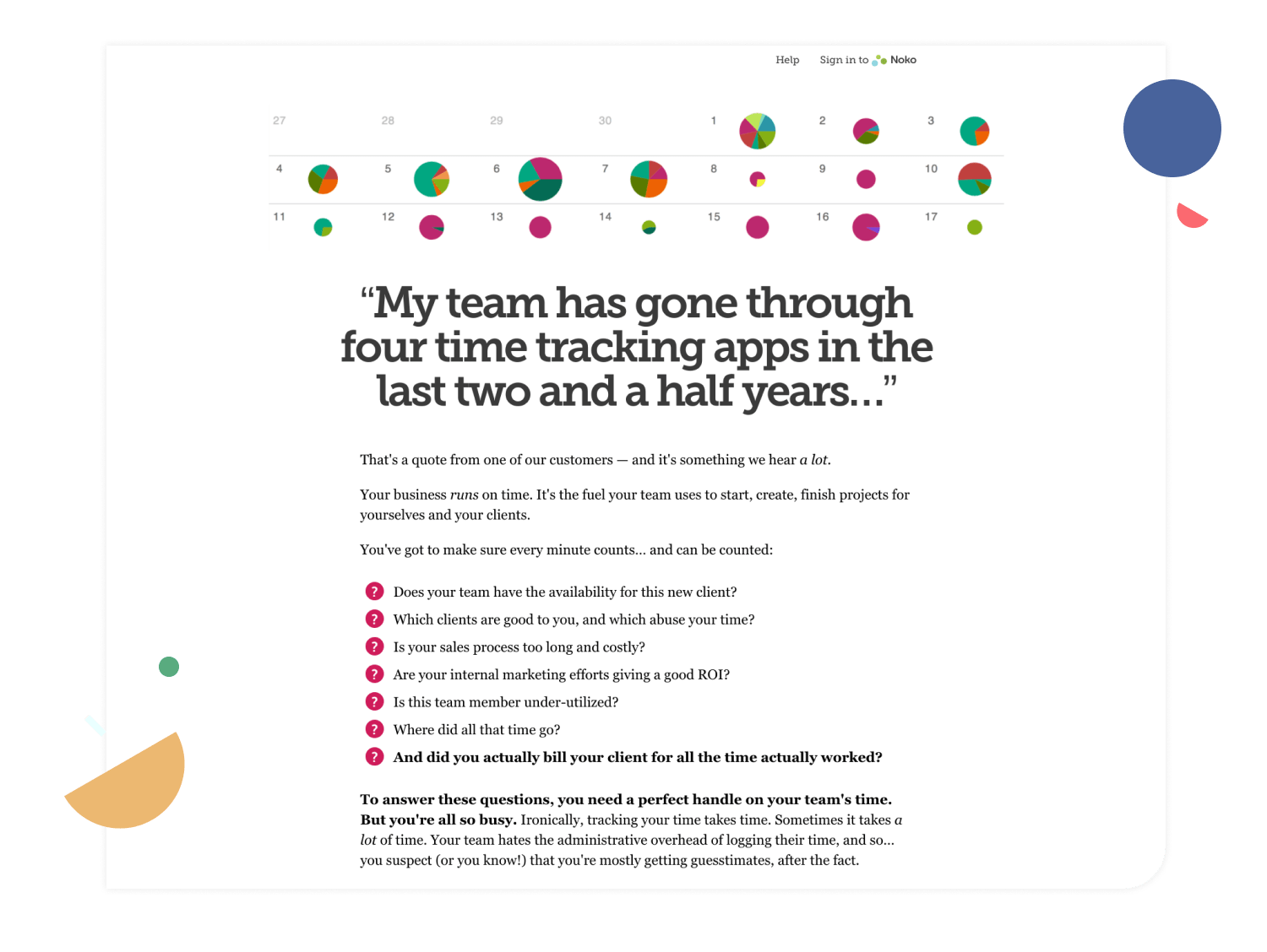
Consider the landing page of a popular time-tracking app. The headline immediately addresses the user’s pain points, and the body copy not only explains these issues but also outlines the benefits of the solution. This landing page stands out as a good lead generation example.
Beyond structuring your copy, consider using narrative devices to connect with your audience. Brief customer success stories can bridge the gap between a problem and its solution. Rather than simply listing benefits, share authentic accounts of how customers have successfully used your product or service. Describe any challenges they faced and how they overcame them. These real-life stories not only build authority but also allow potential customers to envision themselves achieving similar success.
By blending clear, concise language with engaging storytelling, you can create landing page copy that resonates deeply with your audience and drives conversions.
2. Simplify Your Forms
Elaborate design and ergonomic forms have equal importance with copy on landing pages. Overly complicated forms will frustrate leads on your lead generation landing page, even when the offer is very tempting.
Tips on creating a form:
· Restrict to requirements only: Don’t ask for anything that isn’t required. The less fields there are to fill in, the greater the chances of visitors finishing the form.
· Streamline the task: Employ checkboxes, dropdown menus and optional fields to make the task as seamless as possible. This provides positive customer satisfaction.
· Enhance visual appeal: Make sure your form is captivating. Bright colors and clear labels combined with distinct design elements help steer your visitors towards the desired action.
Example of A Landing Page:
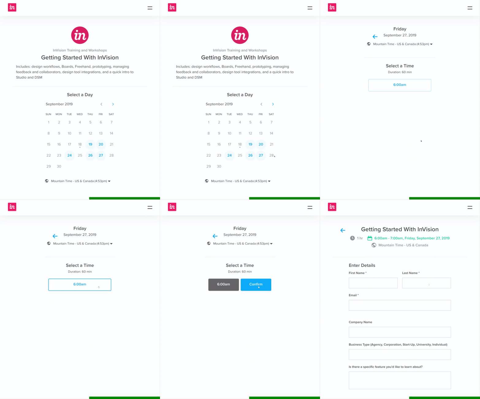
InVision (now Miro) has a stunning webinar signup flow. This process is among the best in lead generation landing page examples available on the internet. The flow starts with the selection of a webinar date and it proceeds to a simplified registration form with three fields.
Also, try advanced forms. Instead of requesting all the information at once, do it in stages over repeated sessions. This strategy greatly enhances the experience and enables you to optimize a landing page for lead generation.
How to Connect and Build Trust Through Content

Building trust is the foundation of any successful conversion strategy on a lead generation landing page. Without trust, even the most enticing offers will fail to convert visitors into leads. In today’s digital landscape, where in-person interactions are rare, establishing confidence through your landing page is absolutely essential.
Here are some effective trust-building strategies:
- Leverage Social Proof
Showcasing testimonials, case studies and customer reviews helps potential leads see the real impact your product or service has had on others. When visitors read about positive experiences from people just like them, it reinforces the idea that your brand is reliable and delivers what it promises. Seeing others endorse your product creates a sense of trust, making it easier for new customers to take the next step. - Use Visual Trust Symbols
Including elements like customer photos and logos from well-known brands quickly signals reliability and professionalism. These visuals act as instant cues that your business is trusted by reputable companies. They help visitors feel more at ease and confident that they’re in good hands, which encourages them to engage further. - Communicate Openly
Being transparent about your privacy policy and the steps you take to protect user data can make all the difference in how visitors perceive your brand. When users can easily find information about how their data is secured, they are more likely to feel comfortable interacting with your site. Clearly communicating your commitment to privacy builds confidence and shows that you value and protect their information.
Landing page example:
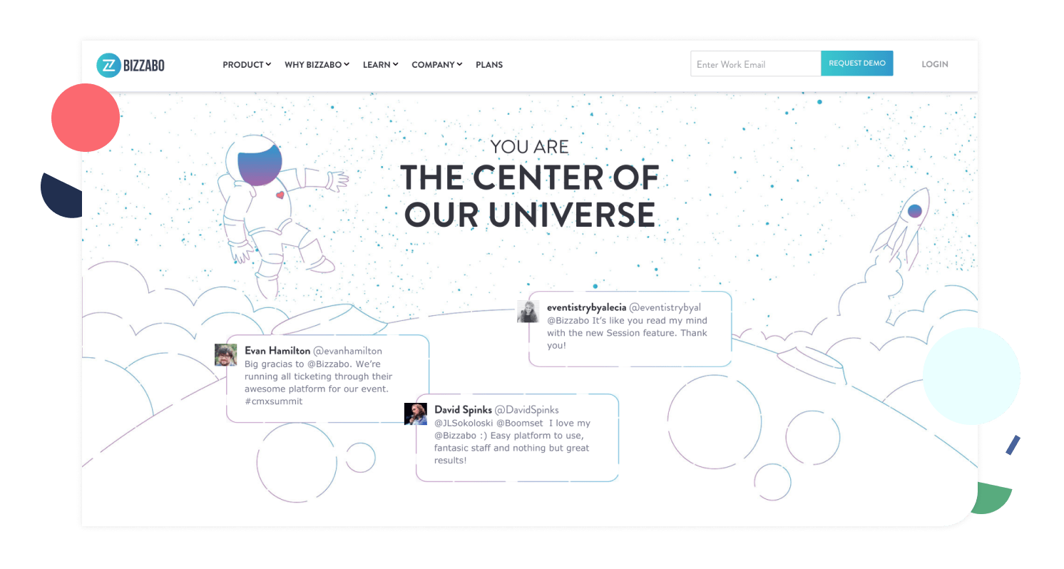
Bizzabo’s landing page is a standout when it comes to building trust. They prominently feature customer testimonials alongside personal photos, which enhance the credibility of their lead generation landing page.
Another powerful approach is to include a brief video introduction. An engaging short video that presents your value proposition can humanize your brand and build trust, sometimes even more quickly than text alone.
4. Formulate a Compelling Call-to-Action (CTA)
Your call-to-action is arguably the most critical element on your lead generation landing page. It acts as the final nudge that transforms a casual visitor into a qualified lead. For a CTA to be truly effective, it must inspire immediate action while clearly outlining the benefits the user will receive.
Here are some strategies to create an effective CTA:
- Customize the Message
Speak directly to your audience by using language that resonates with them. Instead of using generic phrases like “click here” or “sign up,” highlight what they will gain. Tailor your CTA to address their specific needs, such as “Get your free consultation today” or “Start building your brand now.”
- Show the Benefits
Don’t just tell visitors what to do – show them the results. For example, instead of saying “Download our free guide,” say “Start growing your subscribers today” or “Unlock expert tips to boost your business.” Framing the action in terms of the benefits they will experience increases motivation.
- Cultivate Urgency
Encourage visitors to take immediate action with words like “claim,” “get started now,” or “limited-time offer.” A sense of urgency pushes visitors to act quickly, preventing them from delaying and increasing the chances of conversion.
- Make It Action-Oriented
Use verbs that create a sense of action and movement. Instead of passive CTAs like “Learn more,” use active ones such as “Get started,” “Join now,” or “See how it works.” Action verbs make the next step feel tangible and prompt users to take action.
- Make It Visually Stand Out
Ensure your CTA is hard to miss. Use bold fonts and contrasting colours to make the button or link stand out from the rest of the page. The clearer and more eye-catching it is, the more likely visitors will click on it.
- Position It Strategically
Place your CTA where users are most likely to engage. Common spots are at the top of the page, at key points within the content and at the end. Consider a floating CTA that stays visible as users scroll, keeping it accessible at all times.
Landing page example:
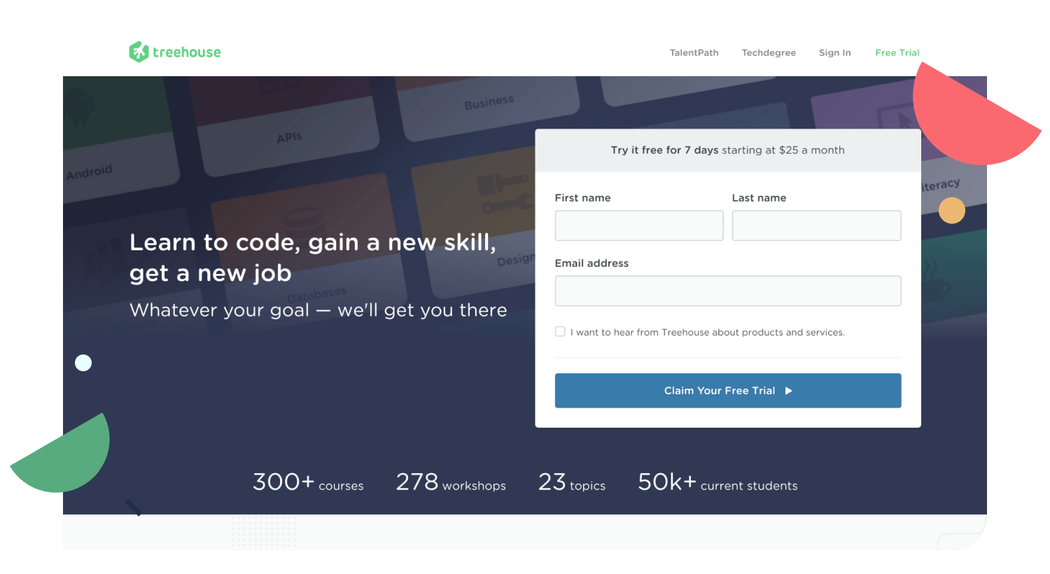
Treehouse uses a compelling CTA that reads “claim your free trial.” This straightforward message, paired with an eye-catching button design, clearly communicates the benefit and prompts immediate action, demonstrating how an effective CTA can drive conversions on a lead generation landing page.
When designing your CTA button, consider its size, color and placement carefully. It should be prominently positioned, ideally above the fold, so that visitors always know what action to take next.
5. Match With Your Marketing Funnel

Even the most effective lead generation landing page is just one part of a broader sales funnel. Once a visitor fills out your form, their journey isn’t over. The follow-up stages are equally crucial in converting interest into action.
Here are some key strategies to ensure your landing page works seamlessly with your marketing funnel:
· Automatic Follow-Up:
Immediately enrol every new lead into a nurturing campaign. This can be done through automated welcome emails, targeted educational content, or personalized messages. Quick follow-up helps keep the momentum going and reinforces the value of your offer.
· Use a CRM System:
Track each lead’s journey from the landing page to final conversion with a robust customer relationship management system. This integration allows you to tailor your communications based on individual behavior, ensuring that every interaction feels relevant and personal.
· Consistent Communication:
Maintain the same tone and style in all follow-up communications as you used on your lead generation landing page. Consistency reinforces your brand promise and builds long-term trust with your audience.
Landing page example:
Imagine a landing page promoting a free trial for a software product. Once a visitor signs up, they receive a series of onboarding emails featuring tips, success stories and limited-time discount offers designed to encourage full subscription. This seamless integration between the landing page and the follow-up marketing funnel is a prime example of how to optimize the landing page for lead generation effectively.
By aligning your landing page with your entire marketing funnel, you ensure that every touchpoint works together to nurture leads and drive conversions.
6. Analyze, Assess and Improve
Every successful lead generation landing page should evolve continuously. What works now might require adjustments tomorrow. Regular measurement, testing and refinement are essential to ensure that your landing page remains both effective and relevant.
Here are some steps to optimize your landing page for lead generation:
· Leverage Advanced Analytics:
Integrate tools like Google Analytics to monitor key metrics such as conversions, bounce rates, traffic and user activity. Setting up conversion tracking helps pinpoint which elements of your landing page are performing well and which ones need improvement.
· Conduct A/B Testing:
Experiment with different versions of crucial elements such as headlines, images, copy length and CTA placement. Tools like Optimizely enable you to run split tests and determine the most effective combinations.
· Analyze User Behavior:
Use heatmaps and session recordings (for example, through Hotjar) to observe how visitors interact with your page. Understanding user patterns can inform improvements in your layout and overall design.
· Iterate Based on Data:
Use the insights from your testing to enhance your landing page. Remember, optimization is an ongoing process, not a one-time task.
By embracing a mindset of continuous improvement and relying on data-driven insights, you can ensure that your landing page not only meets current user expectations but also adapts to future trends and challenges.
Additional Strategies for an Impactful Landing Page
Beyond the foundational elements, there are several advanced strategies you can employ to further enhance your lead generation landing page. These additional techniques help ensure your page not only looks great but also provides an exceptional user experience across all devices.
7. Invest in a Clean, Responsive Design
A visually appealing, clutter-free design is crucial for projecting professionalism and enhancing the overall customer experience, especially for mobile users. A responsive design ensures that your lead generation landing page displays perfectly on screens of all sizes, making it accessible to a broader audience.
· Mobile-First Design:
With the majority of users accessing content on mobile devices, designing with a mobile-first approach is imperative. This strategy ensures that your page is optimized for smaller screens without sacrificing functionality or aesthetics.
· Fast Load Times:
Optimizing images and using efficient coding practices are key to ensuring your page loads quickly. Faster load times reduce bounce rates and improve overall user engagement, which in turn helps to optimize landing pages for lead generation.
8. Use Visuals to Tell a Story
While text is a powerful medium for conveying your message, visuals can often communicate the same ideas more quickly and effectively. Incorporating images, icons and videos on your lead generation landing page can help reinforce key details and engage your audience on a deeper level.
· Impeccable Images:
Choose high-quality images that reflect your brand’s personality and resonate with your target audience. The right visuals can instantly communicate your message without overwhelming text.
· Video Content:
A concise explainer video can capture attention and quickly illustrate what you offer. This dynamic medium is particularly effective in engaging visitors and providing clarity on complex concepts.
· Infographics:
Use infographics to break down complicated data or processes into visually digestible formats. This helps users understand your value proposition at a glance and keeps them engaged.
Landing page example:
By leveraging high-quality visuals, you can tell a compelling story that not only captures attention but also drives conversions on your lead generation landing page. Dollar Club Shave has done this really well by presenting its simple product in a well-styled bathroom that elevates it to feel luxurious.
Start Boosting Conversions Now
Transforming your lead generation landing page into a conversion powerhouse demands ongoing research, testing and refinement. By incorporating persuasive body copy, streamlined forms, trust-building elements, powerful CTAs, seamless marketing funnel integration and relentless optimization, you can turn your landing page into a perpetual revenue-generating machine.
Remember, your landing page is often the very first impression potential customers have of your business. To make that first impression count, pair a visually appealing design with a clear, compelling message and data-driven adjustments. When you deploy the right strategies consistently, you’ll start seeing significant improvements in your conversion rates.
Leverage the real-life lead generation landing page examples and insights provided here to continuously optimize landing pages for lead generation. With persistence and a commitment to ongoing improvement, your landing page will not only attract visitors but also convert them into loyal customers.
Start boosting conversions now and watch your business grow!
Final Pro Tip:
Make it a habit to regularly check your analytics and listen to your users. Since technology and user preferences change frequently, staying on top of your data and making timely updates is essential for long-term success.
Conclusion
Building a lead generation landing page is all about the details, from crafting persuasive body copy and incorporating trust-building elements to designing effective call-to-action buttons. Think of it as setting up the perfect welcome mat for your visitors. When you put these strategies into action and explore the actionable lead generation landing page examples in our guide, you’re likely to see your conversion rates soar. Always remember to test and tweak your page to optimize landing pages for lead generation, keeping you one step ahead of the competition.
Thank you for taking the time to dive into our comprehensive guide on building an effective lead generation landing page. If you have any questions or need a hand with your online marketing strategy or lead generation content services, please feel free to reach out.
FAQ
Q: How can I optimize my lead generation page for mobile devices?
A: One of the first things to consider is a mobile-first design. Make sure your lead generation page automatically adjusts to different screen sizes so it looks great on any device. Compress your images for faster loading and use buttons and forms that are easy to tap. Testing on multiple devices helps ensure your page is user-friendly and performs well on mobile.
Q: What are the most effective lead generation pages?
A: A winning lead generation page balances strong visuals with clear, concise text. High-quality images, well-crafted headlines, and engaging copy set the stage. Then, add elements like customer testimonials, reviews, or case studies—these build social proof and trust. Combining these elements makes your page more inviting and credible, which can really help drive conversions.
Q: Which marketing channels are best for driving traffic to my lead generation page?
A: The best channels often depend on your specific audience, but generally speaking, social media ads, email marketing, and SEO are great starting points. Social media ads help you reach a large, targeted audience quickly. Email marketing allows you to engage with an already interested audience, and SEO helps your page appear in search results, attracting organic traffic. Using a mix of these channels can drive quality traffic to your lead generation page.


