


Originally published June 7, 2016 , updated on February 16, 2026
Colour choices in event design are more important than most people realise. There is almost no way for an event to be 100% successful if the design is not up to scratch. The correct colour palette is the very foundation of your decor; and event attendees’ experience begins with the eye.
The Emotional Connection

Whether you choose to believe it or not, the colours in your surrounding environment can have a very real effect on your mood. Certain bright colours inspire high energy buzz whilst others have a more soothing effect. You need to think carefully about the core concepts behind your event, and the kind of vibe you’re hoping to generate.
Don’t Clash Colour with Your Venue
When choosing your colour palette, you need to remember that you’re not starting with a completely clean slate. Your venue already comes with an array of its own colours which will need to work in cohesion with your choices.
A single colour can look completely different depending on its surroundings. Some colours compliment each other whilst others are in complete contrast.
Play it Safe, Go Monochromatic
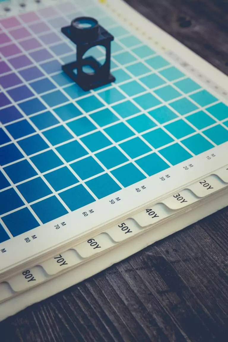
If you’re worried about a colour clash, you have the option to choose a monochromatic palette. It almost seems as though monochrome will never go out of style – and that’s a real stroke of luck in terms of event design. Choose a single colour and work with varying shades (darker and lighter) thereof. You can go two ways with this: subtle or dramatic.
Keep Your Colours Simple with Neutrals
Neutral colours are quite often the favourite for people who aren’t fully acquainted with the ins and outs of design. There’s a very real sense of comfort in neutral colours – it feels a bit like home. Neutral tones lend an air of relaxation and calm. You can add an accent colour here or there for that bit of pizzazz if you feel the need.
Post Views: 2211
Originally published June 7, 2016 , updated on February 16, 2026

Popular Posts


Contact Us
"Working with Goodman Lantern has been fantastic. From the evaluation process to our current day-to-day it has been a pleasure. They have been accommodating and helpful throughout the entire engagement. The deadlines are always met and the communication is consistent. You'd be amazed at how many partners struggle with this. I would recommend them to anyone looking for content services." Jeff Soriano,
Brightflag - VP Marketing